
The existing site was visually outdated, structurally inconsistent, and difficult to navigate. Clients struggled to locate services or equipment details, and the layout was cluttered and redundant.
Methods:
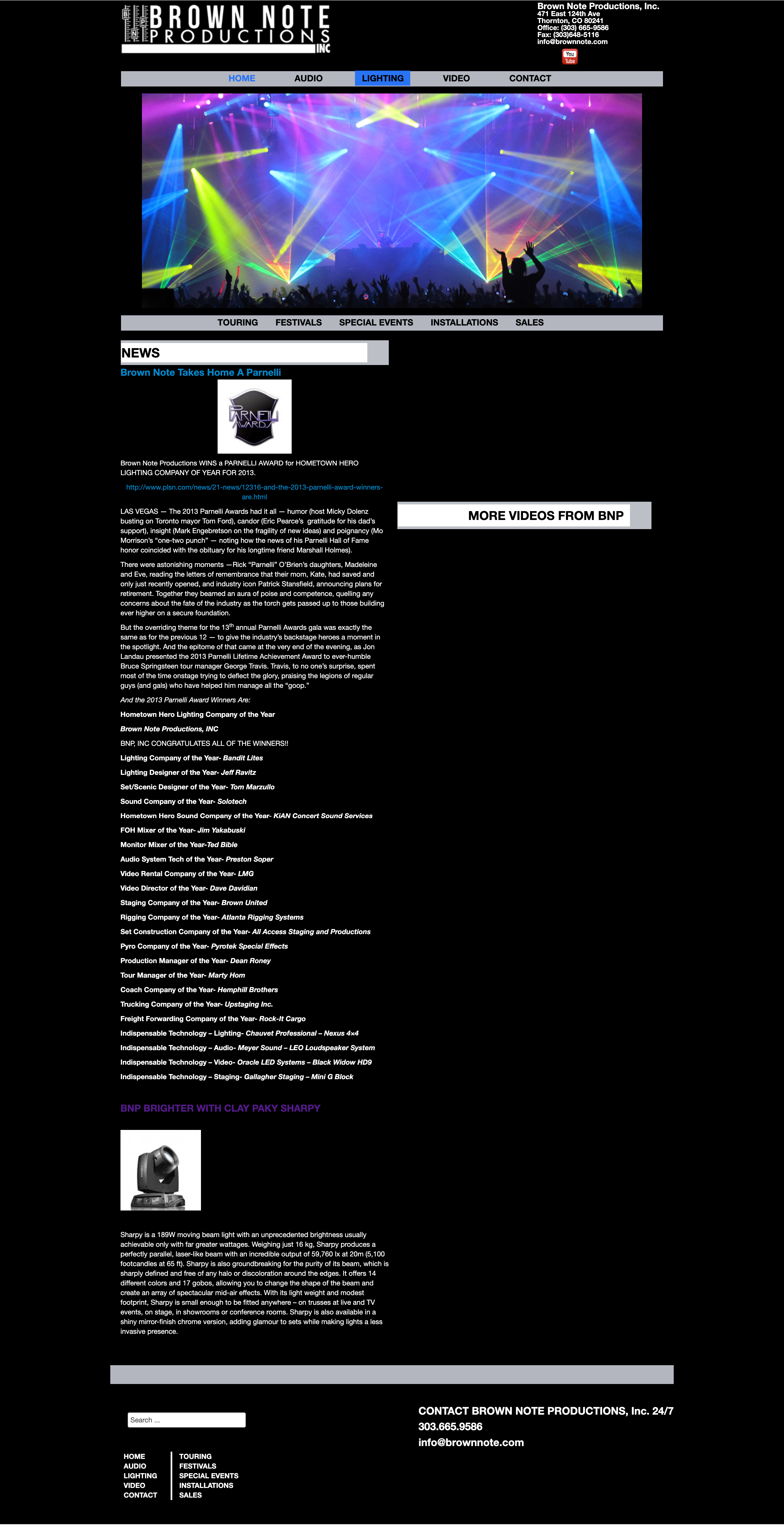
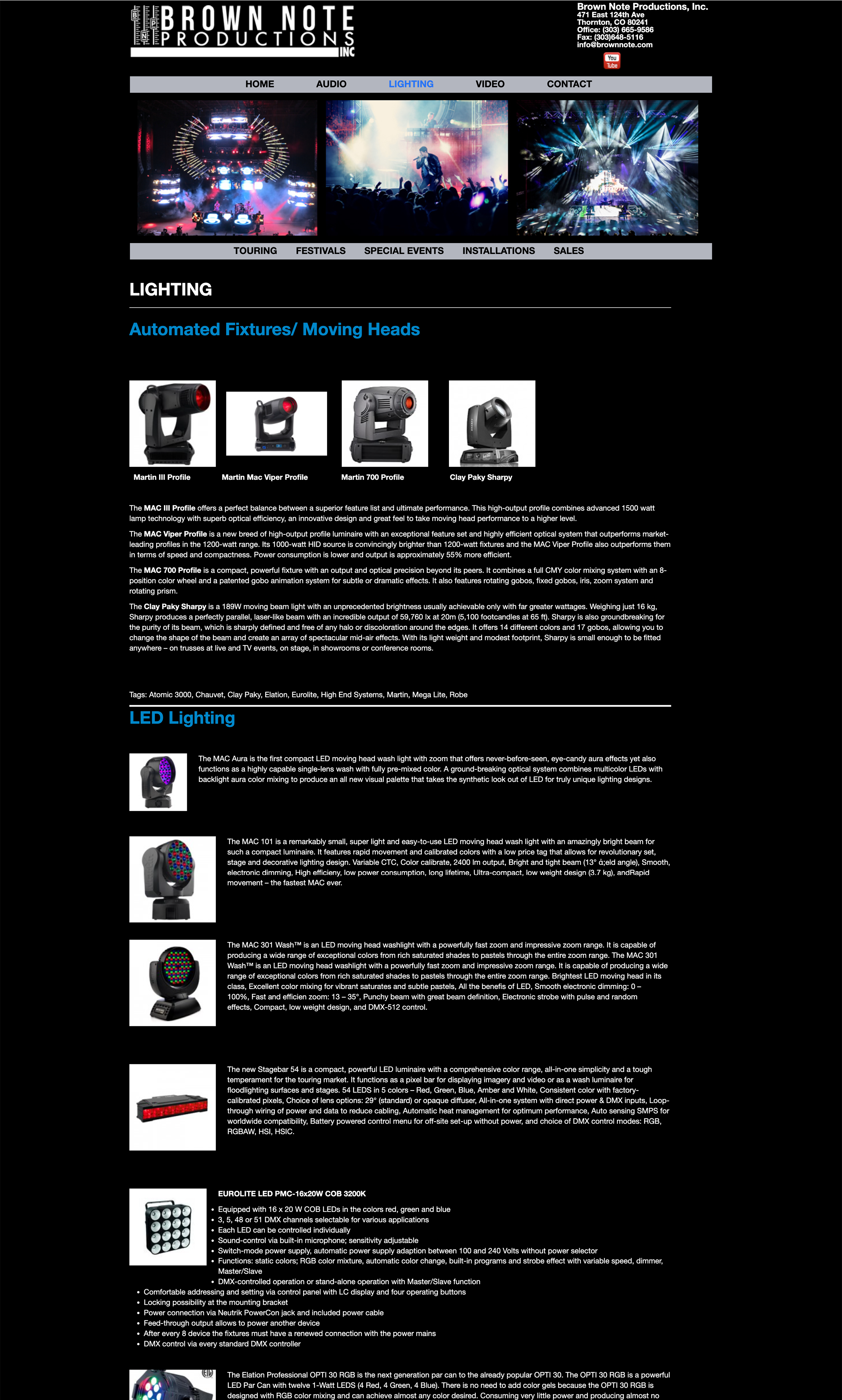
Key UX Pain Points Identified:
Navigation:
Header/Footer:
Homepage:
Inventory Pages:
My design recommendations focused on clarity, consistency, and usability—bringing visual polish and information architecture in line with user expectations and business needs.
Navigation:
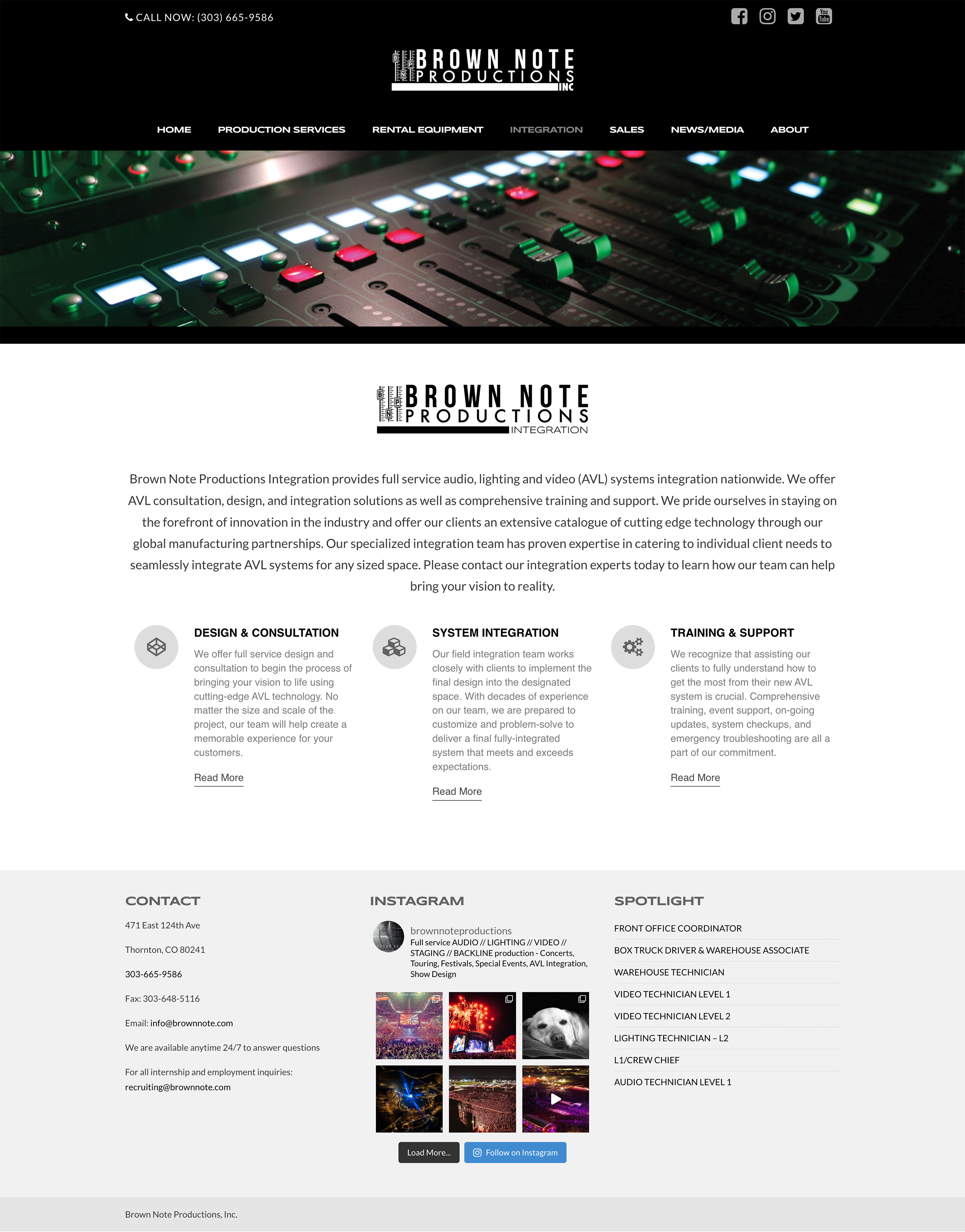
Header/Footer:
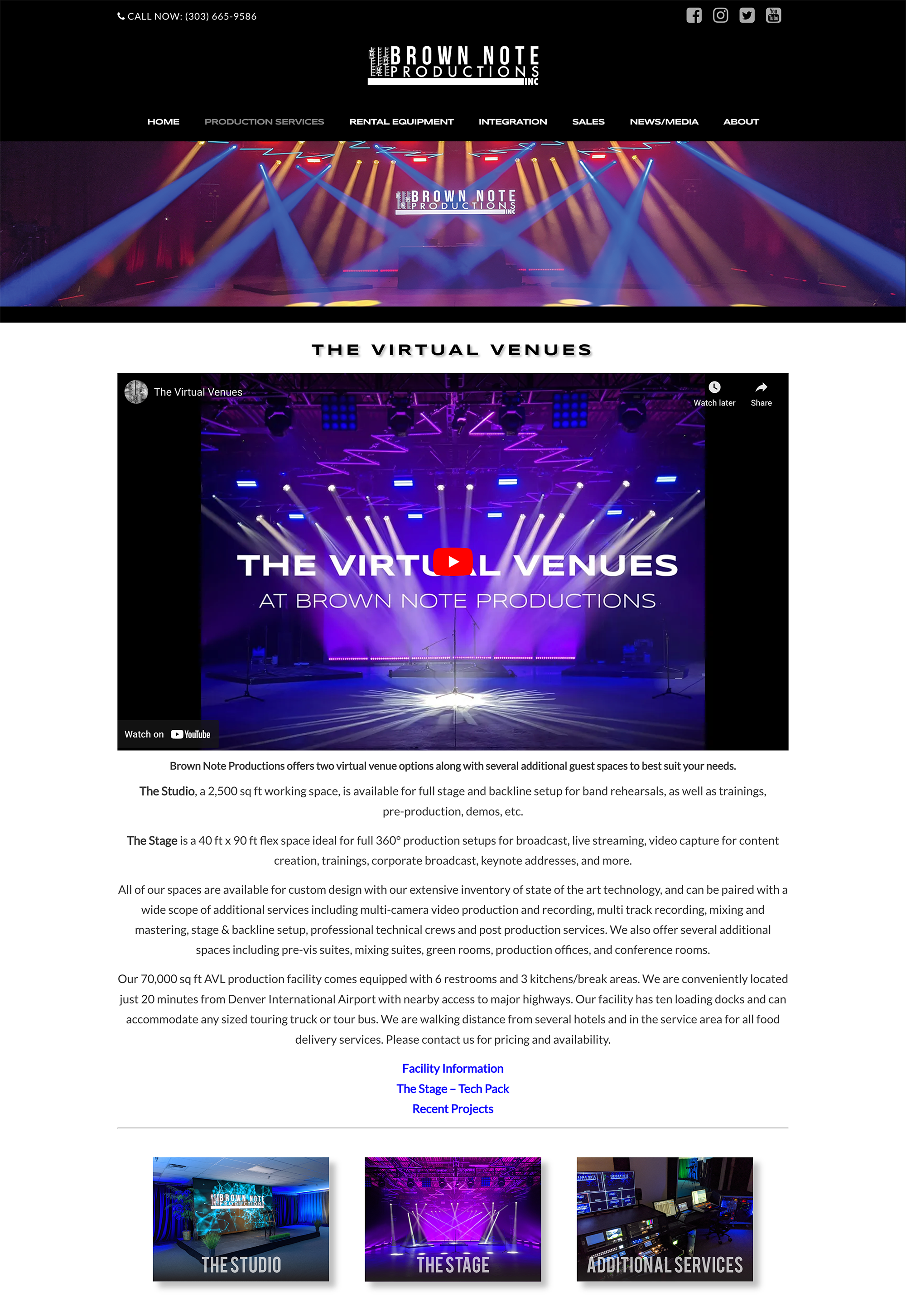
Homepage:
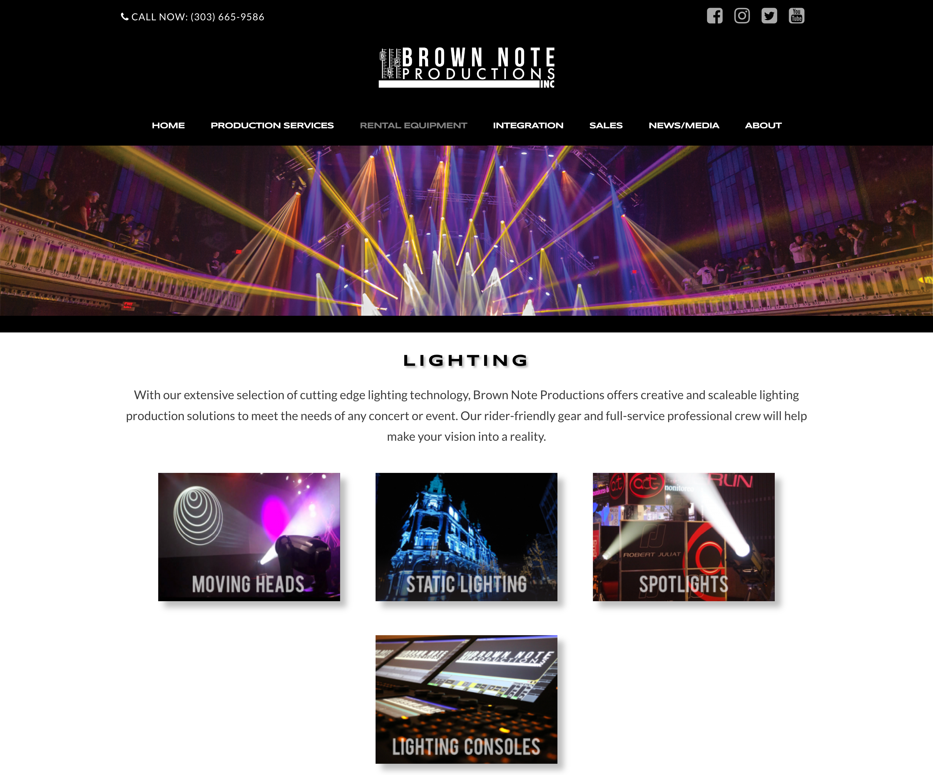
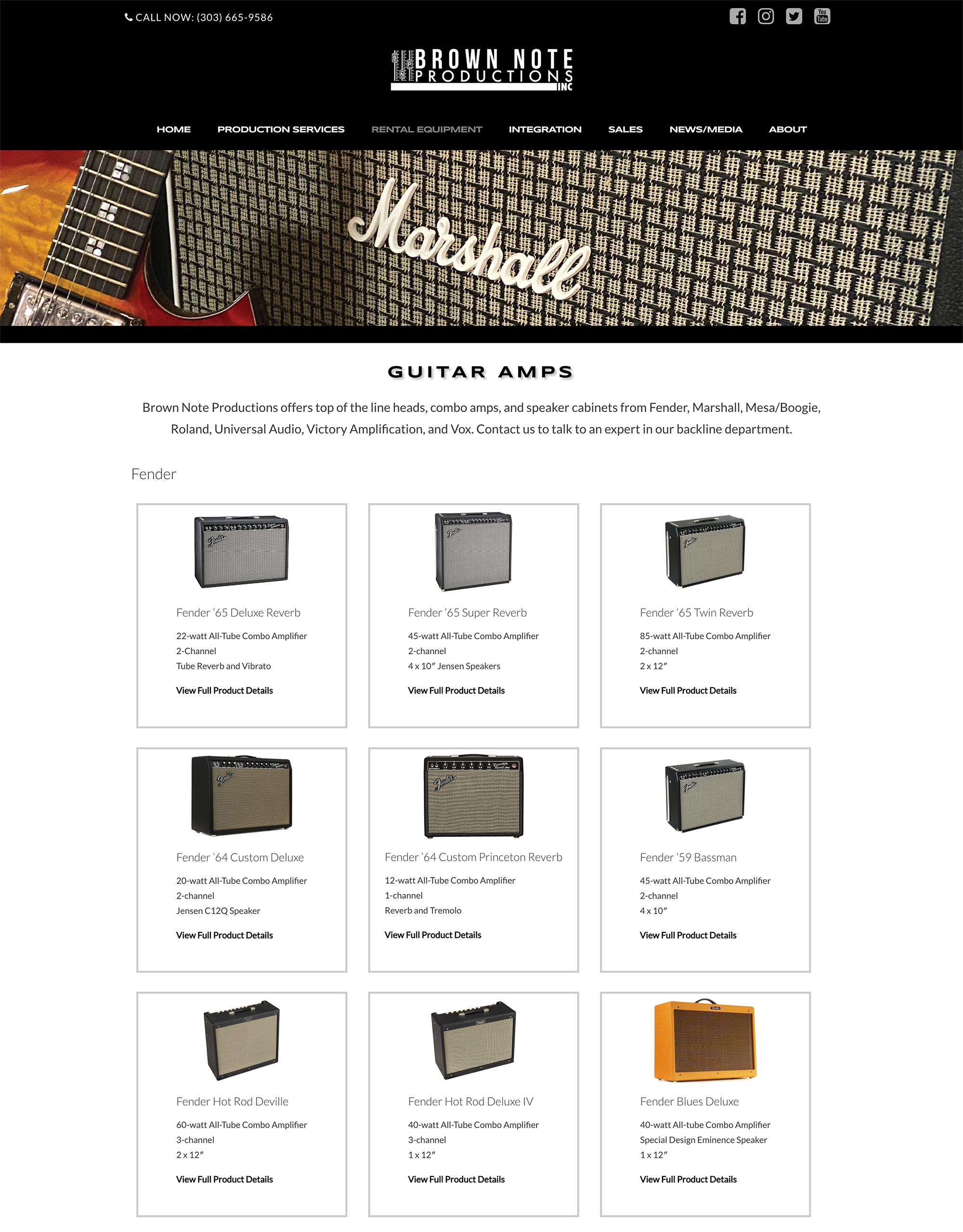
Inventory:
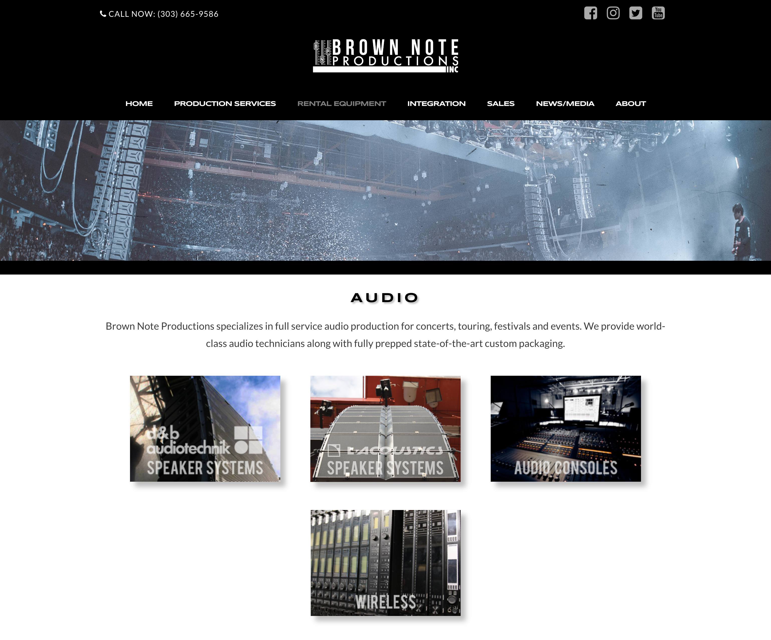
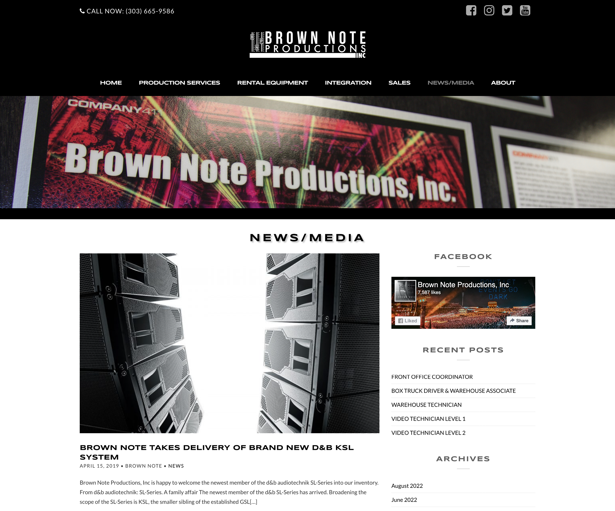
Final site was built in WordPress with custom CSS for layout consistency and responsive design. Key upgrades included:

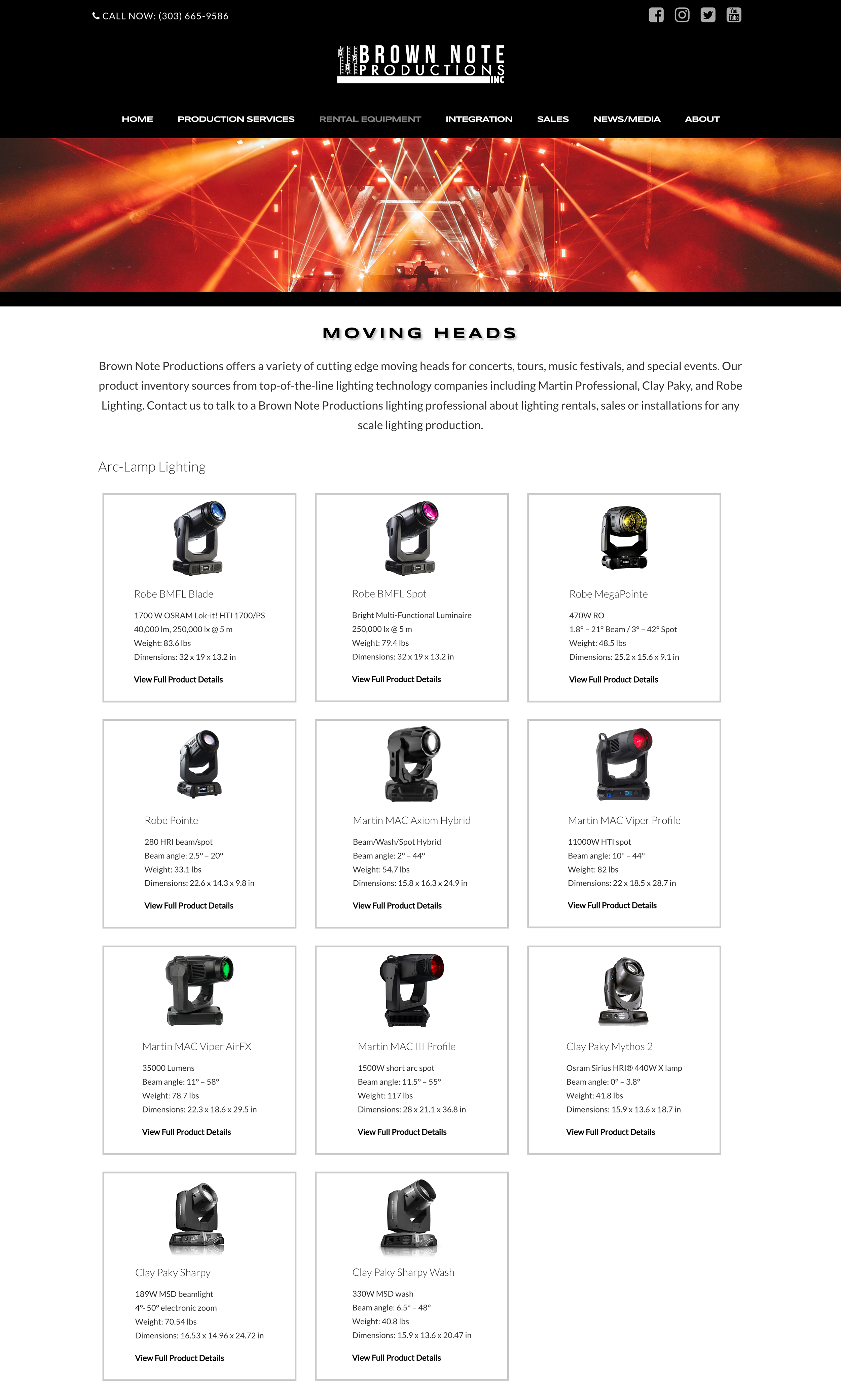
The redesign significantly improved user experience and business outcomes. Clients were able to navigate the site more easily, quickly locating the services or rental gear they needed—leading to a noticeable uptick in customer satisfaction and self-service efficiency. The streamlined inventory pages and optimized content structure also boosted the site’s search visibility, driving more organic traffic and inbound inquiries. Most importantly, the improved access to gear and services directly supported rental conversions. The new site architecture also proved scalable, allowing for seamless expansion as the company introduced new departments and offerings in the years following launch.
Please don't hesitate to reach out if you'd like to learn more about me or if you're interested in working together. Send me a message or shoot me an email at annaleightc@gmail.com