UX Case Study | Mobile App | General Assembly
Overview
Foodi is a mobile app concept designed to help food-lovers discover and share trusted restaurant recommendations—cutting through the noise of crowdsourced review platforms. Inspired by my own search for authentic, memorable dining while traveling, I led end-to-end design: from research and strategy through prototyping and usability testing.
Tools used: Figma, Maze

The challenge: In a sea of online reviews, how might we design a platform that connects users to trusted recommendations from real people they value—friends, locals, and culinary experts?
Research Goals
Key Insights
These findings pointed to a trust-first, socially connected solution—not another review platform.
Users didn’t want more information—they wanted better information. I reframed the problem as:
"How might we help food lovers discover and share trusted culinary experiences with their network?"

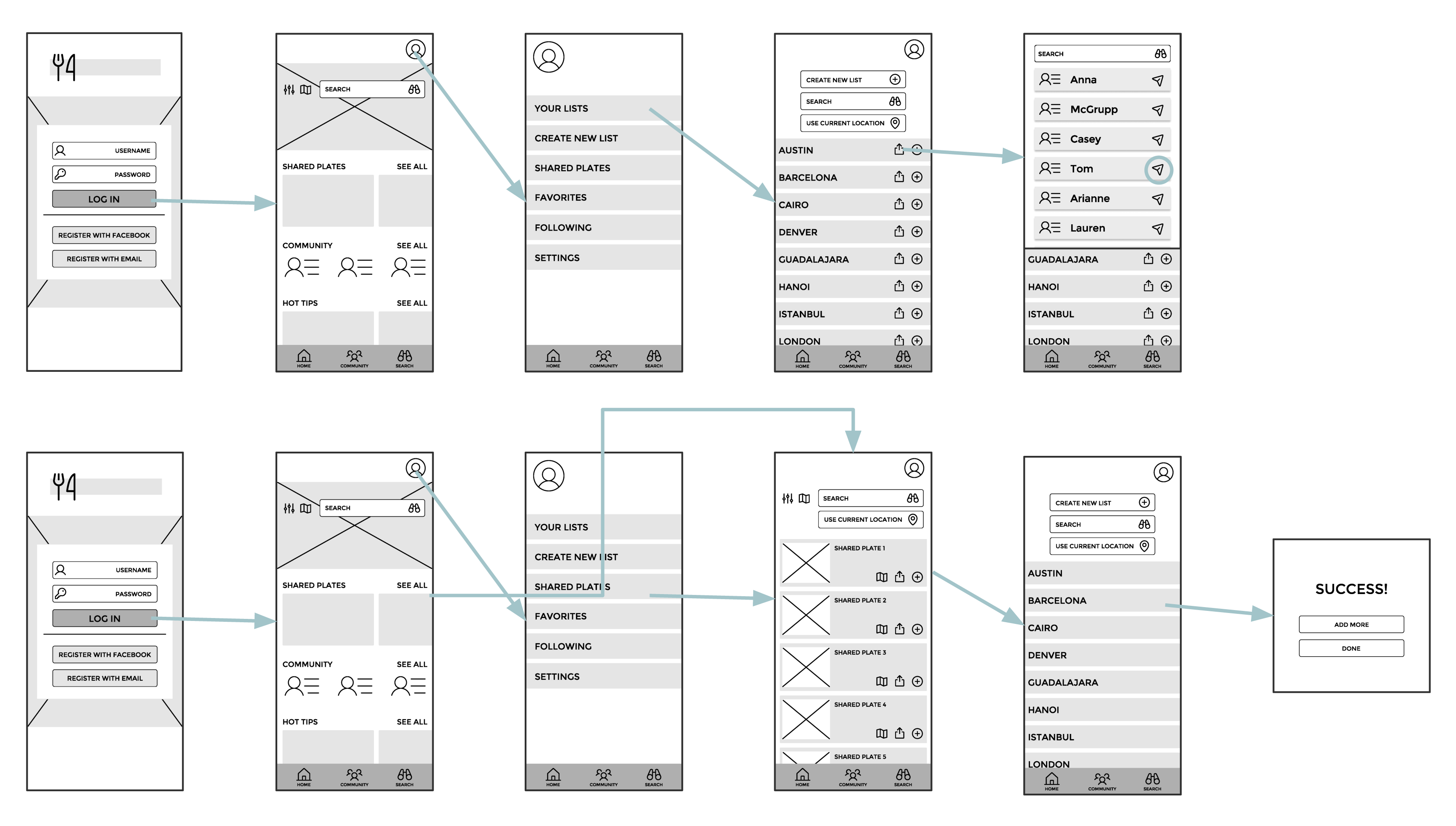
✅ Users understood the core functionality of “add to list” and “share” icons
❌ “Shared Plates” label was confusing and unclear
❌ Profile-based navigation was underused and unintuitive
Inspired by neon-lit food stalls in Hong Kong, the UI uses bold color and contrast to reflect a sense of discovery and energy. A feedback session highlighted areas for layout clarity and accessibility, which I incorporated into revisions.

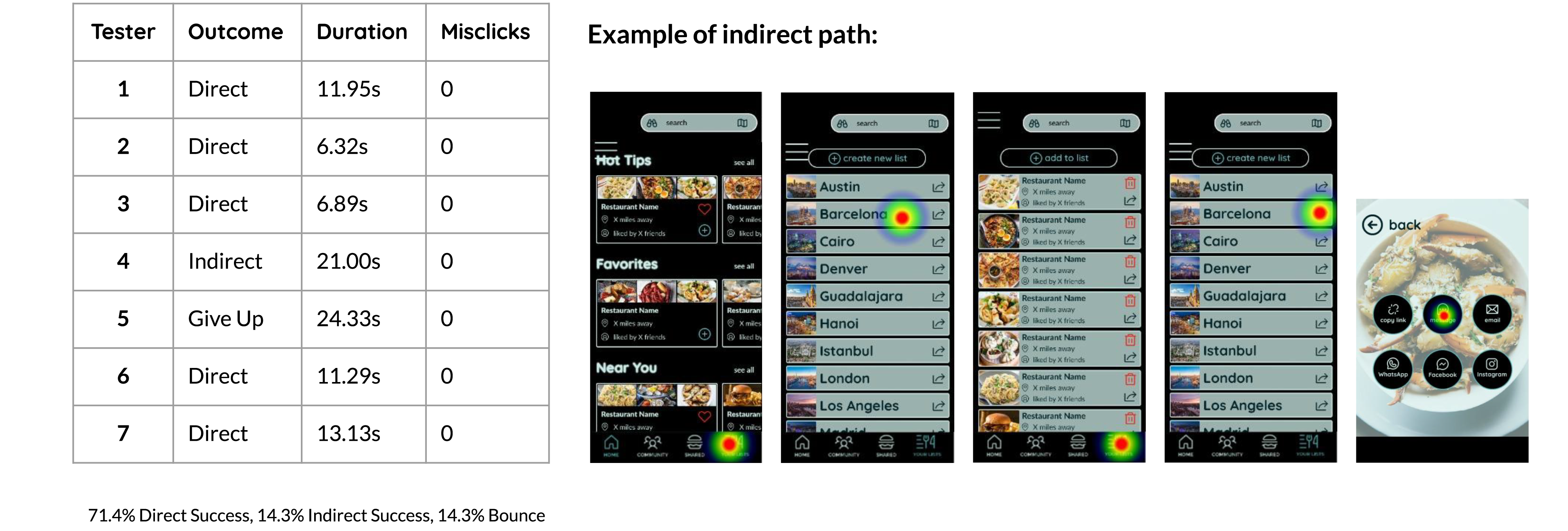
Issue: Users tried to share from within the list, not thelist directory
Severity: Minor
Solution: Add a share button within the city list view
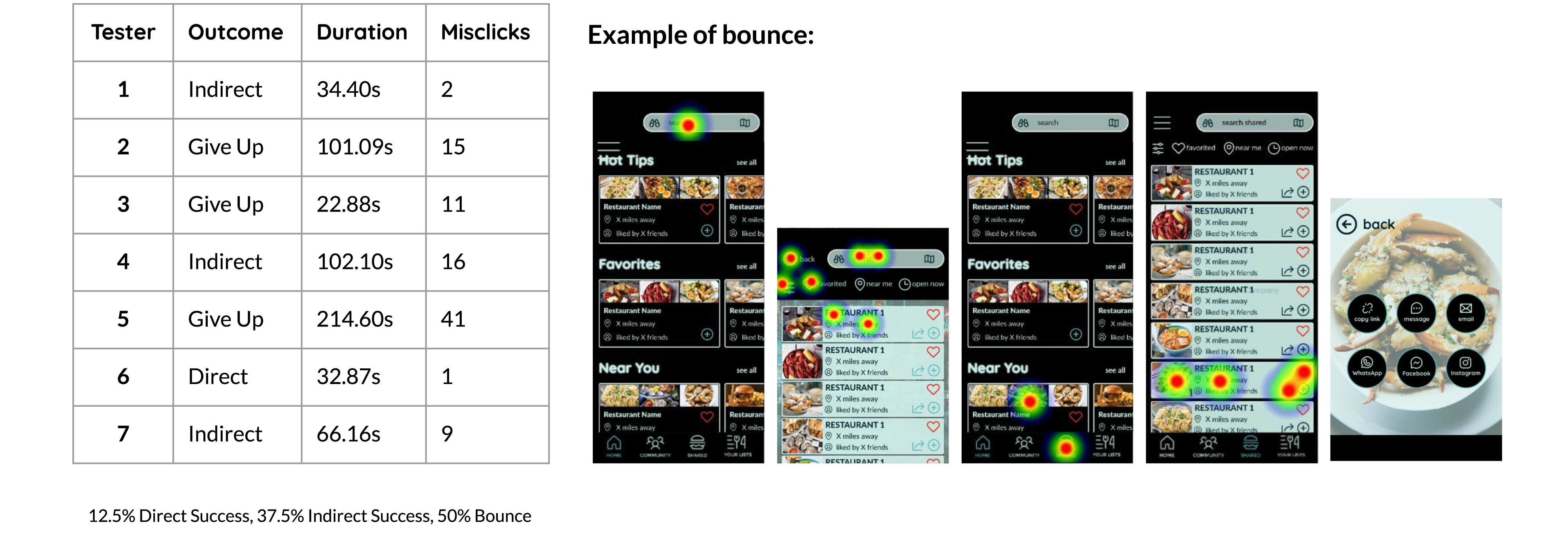
Issue: Users looked for the restaurant via the search function, not the shared list tab
Severity: Serious
Solution: Streamline by removing the in-app “Shared” tab—focus on external sharing only
This project was a full dive into UX—from ideation to iteration. While I came in excited about UI, I left with a deep appreciation for research. Synthesizing qualitative data into actionable insights was especially rewarding and validated my interest in user-centered design. Balancing this project with a full-time job taught me the value of timeboxing, prioritization, and iteration.
Please don't hesitate to reach out if you'd like to learn more about me or if you're interested in working together. Shoot me an email at annaleightc@gmail.com
