MELE

Personalized Skincare Meets Community-Centered Design

Pop-Up Experience + Face-Mapping Web App | Design for America x Unilever Summer Accelerator

Overview
As part of Design for America's Summer Accelerator, our regional design team was tasked with creating a solution for Unilever’s skincare brand, Mele. Our challenge: design an experience that empowers users—especially skincare beginners—with science-backed guidance, personalized recommendations, and real-world accessibility.

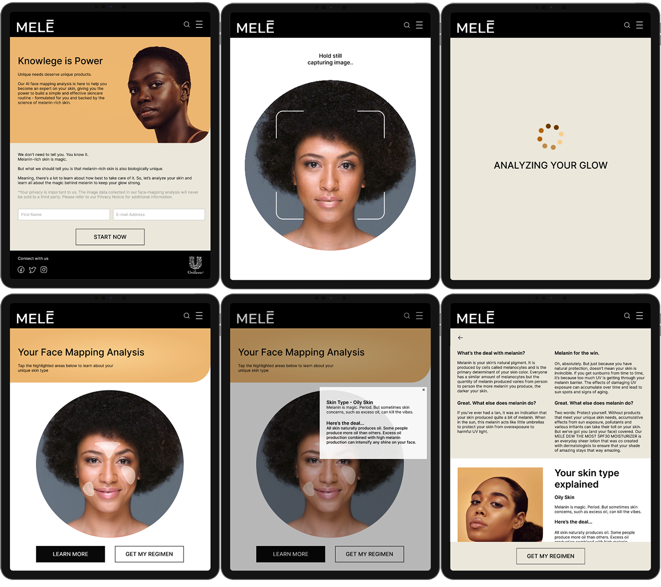
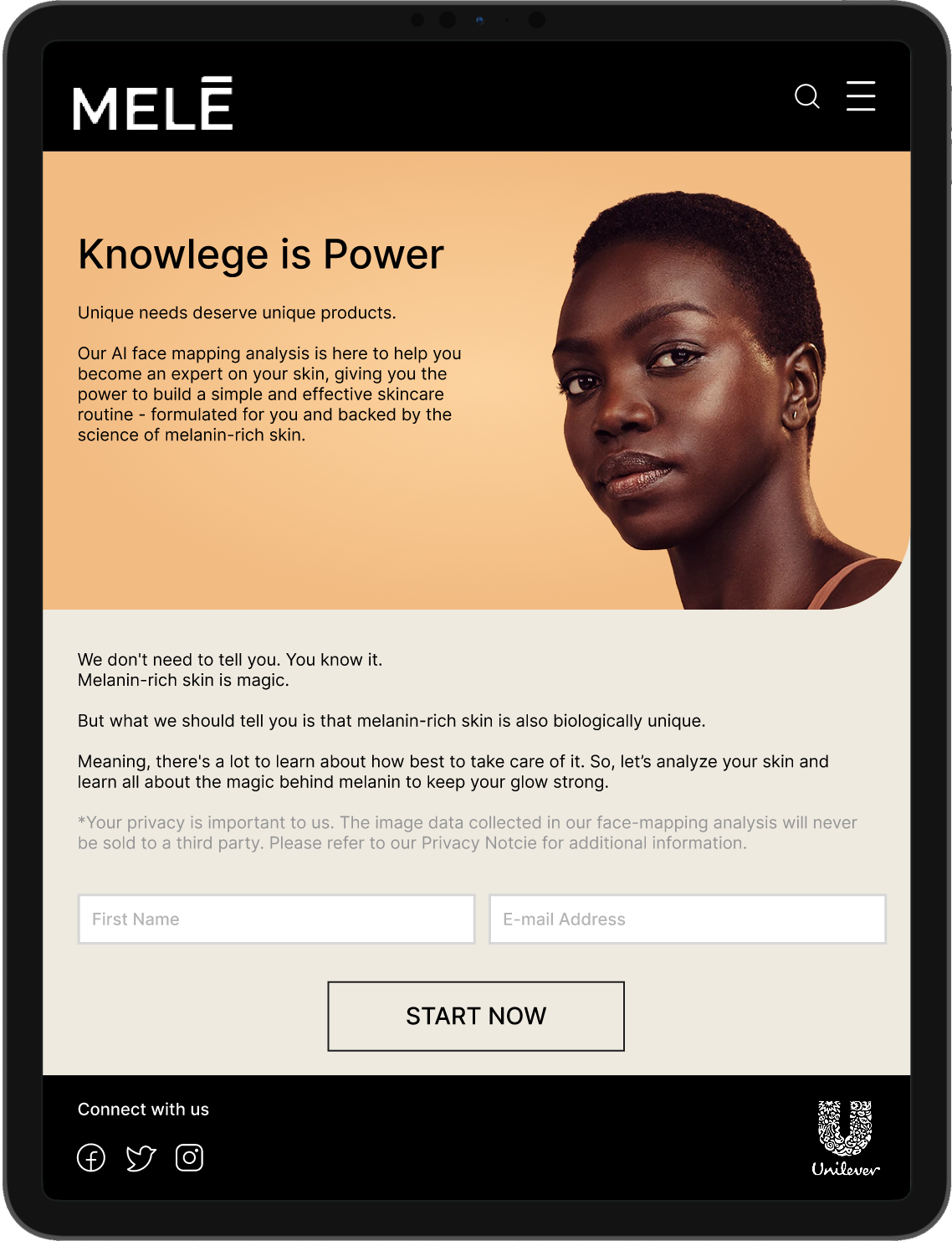
I was responsible for designing and prototyping the digital face-mapping experience, from login through results, and participated in collaborative research and synthesis.
1

DISCOVER

2

DEFINE

3

IDEATE

4

PROTOTYPE

5

REFLECTION

DISCOVER

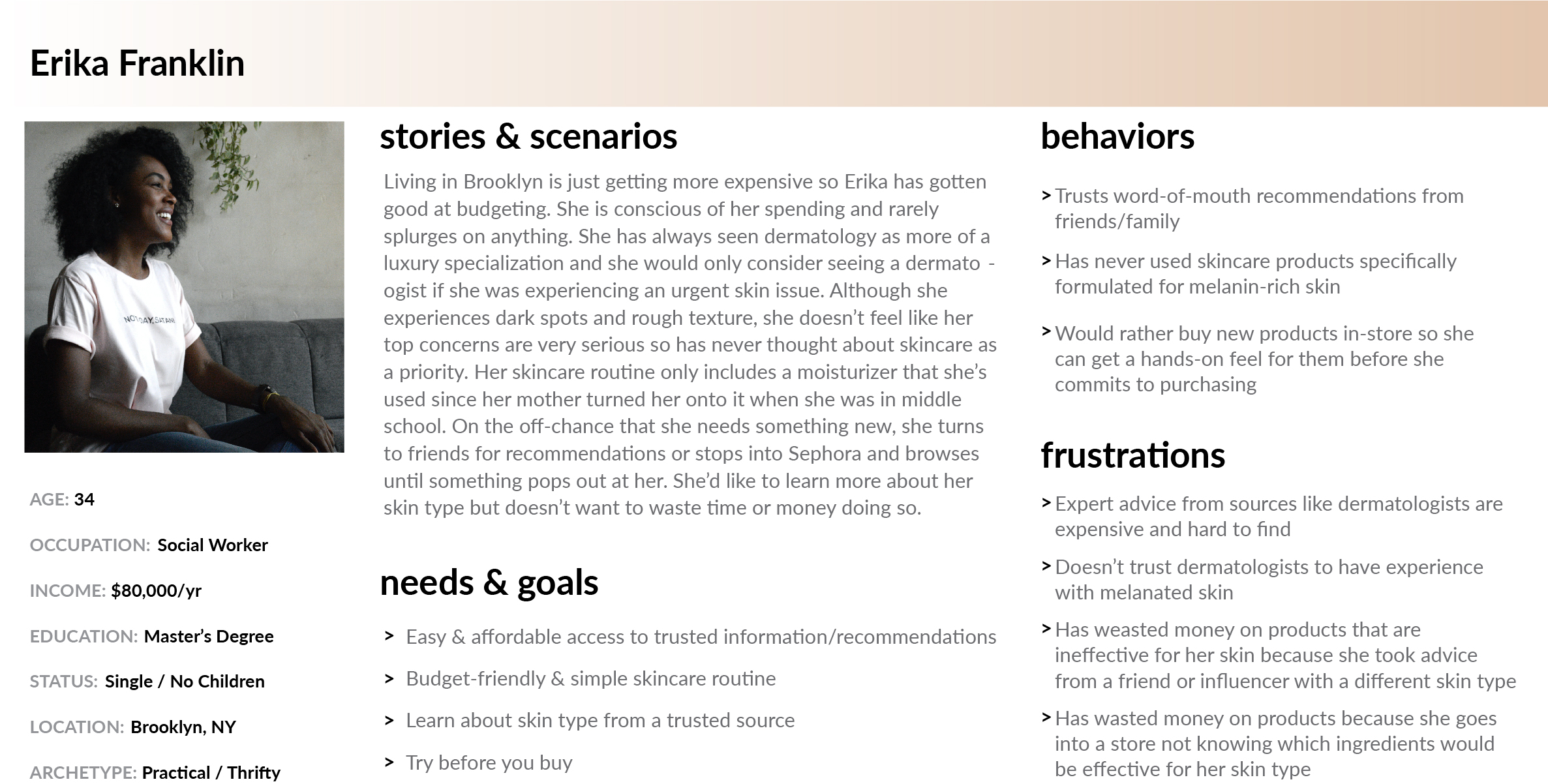
We began with secondary research to understand skincare skepticism, trends in consumer behavior, and user attitudes toward personalization and technology. This informed our user interviews and surveys.

Key Insights:

  • Users distrusted advice from dermatologists and influencers who didn’t share their skin type
  • First-time users prioritized simplicity and didn’t want to waste time or money
  • In-store sampling was preferred, but access and expertise varied widely
  • Trust came from community: friends, word of mouth, and in-person associates

DEFINE

These findings shaped our reframed challenge:

"How might we provide accurate, personalized skincare guidance to new users—without overwhelming them?"

Design Goals:
  • Provide trustworthy, science-backed content
  • Offer personalized routines based on real-time diagnostics
  • Enable product testing before purchase
  • Make access feel approachable, not clinical

IDEATE

We generated ideas ranging from mobile tools to in-store tech. Using dot voting and effort-impact analysis, we prioritized a hybrid concept:

  • A traveling pop-up experience at schools, festivals, and community centers
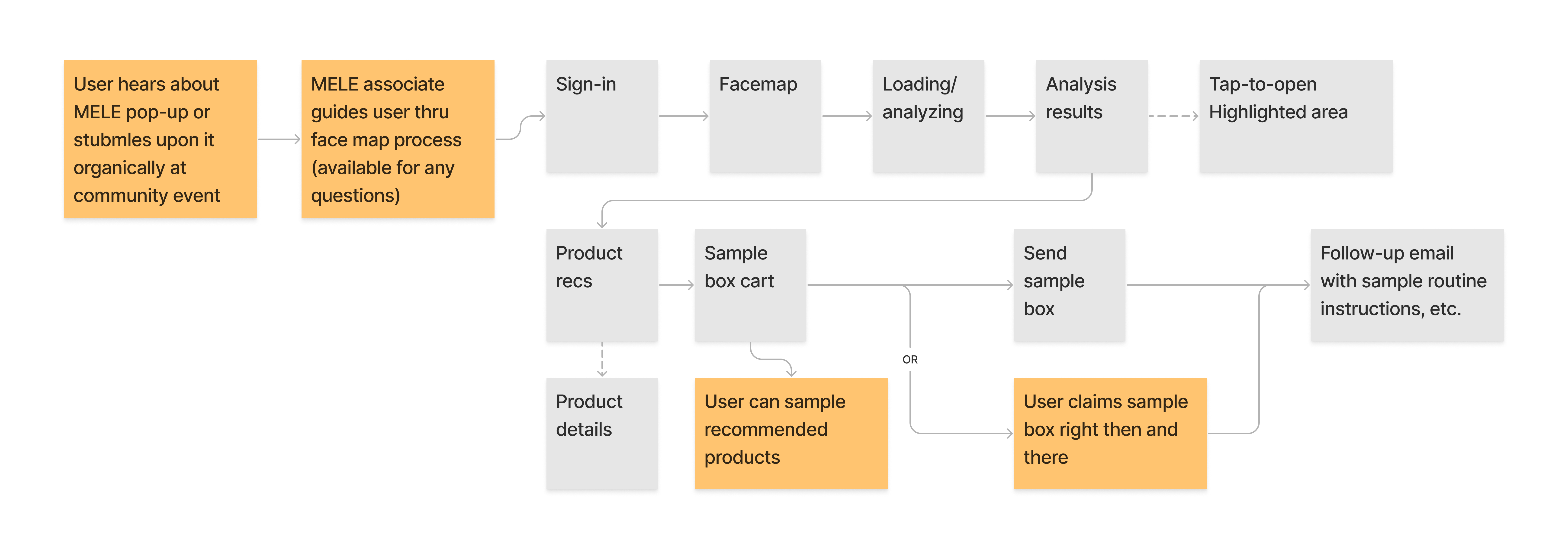
  • A face-mapping app offering a real-time skin analysis and curated product sample box
  • Emphasis on education, accessibility, and trust

PROTOTYPE & TEST

I designed and linked the web app’s key flow: sign-in → face-mapping analysis → results/recommendations. The full prototype was built in Figma and tested via Maze.
Usability Testing

Key Takeaways:

  • ⏱️ Users wanted a faster, less text-heavy experience
  • 🔐 Concerns were raised about privacy and facial data use
  • 📦 Users didn’t want to choose sample products—they wanted everything
  • 🚚 Preference for flexible fulfillment (on-site or shipped)

Iteration & Final Prototype

Iteration Highlights:

  • Streamlined text into expandable sections for quicker scanning
  • Added transparent privacy messaging and consent prompts
  • All recommended products auto-included in the sample box
  • Gave users the option to claim box in-person or have it shipped
VIEW PROTOTYPE

RELFECTION

This was a rewarding team-based project with real constraints—remote collaboration, time zones, full-time work, and limited testing rounds. We used weekly check-ins, a shared FigJam board, and Slack recordings to keep communication clear and inclusive.

While we only had time for one round of testing, the final concept was well received by DFA, Mele brand leads, and Unilever scientists. Feedback highlighted the clarity of our user journey, the hybrid digital/in-person experience, and the design’s accessibility and cultural relevance.

Get in touch

Please don't hesitate to reach out if you'd like to learn more about me or if you're interested in working together. Send me a message or shoot me an email at annaleightc@gmail.com